5 Signs Your Branding Looks AI-Generated (And Why Customers Notice)
Lillian O'Halloran
July 10, 2026 · 8 min read

Trust your gut feeling
You can usually feel it before you can explain it. You land on a website, or scroll past an ad, and something just reads as… off. A little generic. A little cheap. You couldn't necessarily say why but somewhere in the back of your mind, you've already quietly decided not to trust it. That instinct is becoming one of the most important forces in branding right now. Because in 2026, looking AI-generated has quietly become a problem worth taking seriously. To be clear, this isn't a piece about avoiding AI. We use it ourselves, every day - we've written about exactly how, and where we draw the line. The issue was never the tools. It's what happens when branding is left to them, with no human steering. When everyone has access to the same generators, trained on the same average of everything that came before, a very particular look has flooded the market: polished, plausible and completely forgettable. And customers have started to notice.
Worse, they've started to read it as a signal. In a world drowning in AI-perfect sameness, the brands that look considered and human stand out and the ones that look machine-made quietly broadcast "we didn't invest much here." That's not a message you want attached to your business. So here are five tells. If a couple feel a little close to home, don't panic the fix is very doable, and we'll get to it.
Look Out For These
1. A logo that doesn't survive real life
AI loves to make a logo look impressive in the preview and fall apart everywhere else. You'll often spot one of two failure modes: a mark so over-detailed it turns to mush the moment it's shrunk to a favicon or stitched onto a polo shirt, or a bland, perfectly symmetrical swoosh that could belong to literally any company in any sector.
The common thread is that the mark doesn't mean anything. It's decoration where there should be an idea. A logo's job is to be distinctive, legible at every size, and tied to something true about your business. A generated one tends to be busy or generic rarely both useful and ownable.
2. Imagery that's subtly unreal
This is the one customers feel fastest, even if they never consciously register it. AI imagery has a tell: skin that's a touch too smooth, hands that don't quite add up, lighting that's a little plastic, odd artefacts lurking in the background, melted nonsense where text should be on a sign or a label.
The same goes for that glossy, gradient-heavy "AI illustration" style that's suddenly everywhere the one that looks identical across a thousand unrelated brands. Your audience can't always name what's wrong, but their gut whispers "this isn't real," and authenticity drains out of the brand a drop at a time.
3. Words that sound fluent but say nothing
AI copy is grammatically flawless and almost always hollow. If your messaging is wall-to-wall "elevate your journey," "unlock your potential" and "seamless solutions," you've got the generic-AI-voice problem; fluent, confident, and interchangeable with every competitor on earth.
Watch for the visual version too: text generated inside an image, where a product label or shopfront sign in your hero shot reads as garbled half-words. Real brand language says something only you could say. Filler says nothing, and customers have got very good at scrolling straight past nothing.
4. Nothing quite matches anything else
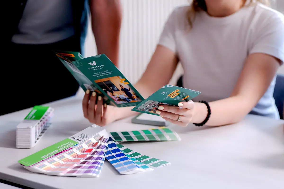
A proper brand is a system; the same fonts, the same exact colours, consistent spacing and logic running across your website, your social posts, your emails and your print. When branding is generated piecemeal, asset by asset, that coherence never forms. The font on the site isn't quite the font on the Instagram grid. The blue on the business card is nearly the blue on the homepage.
Individually these are tiny. Collectively they read as disorganised and people unconsciously extend "their branding is a bit all over the place" to "are they a bit all over the place generally?"
5. It looks exactly like your competitors
This is the deepest one, and the hardest to see from the inside. AI is trained on the average, so it pulls everything towards the middle: the same trendy sans-serif, the same soft gradient, the same safe minimalism, the same stock feel. The result is branding that's perfectly competent and completely anonymous, nothing ownable, nothing memorable, nothing a customer could pick out of a line-up a week later.
If you could swap your logo for a competitor's and barely anyone would notice, that's the sign. Distinctiveness is the entire point of a brand, and it's the first thing that gets sanded off when a machine is left to decide.
Why customers notice, even when they can't explain it
Here's the uncomfortable bit. People read polish as effort, and effort as trustworthiness. When something looks carefully made, the unspoken assumption is that the business behind it is careful too. When it looks generic and machine-made, the opposite assumption creeps in: if they cut corners here, where else are they cutting them? Almost nobody articulates this. They don't think "ah, AI-generated branding, how off-putting." They just feel a flicker of doubt and move on to the option that felt more solid. That flicker is a tax on every bit of branding that looks like it came out of a machine, and it's being paid in lost trust and lost customers before a single word of your offer has been read.
The fix isn't to ditch AI
It's worth saying again the answer here is not to swear off these tools. They're genuinely useful, and the best studios (us included) use them constantly. The answer is to put human judgement back in the driving seat: a real idea behind the mark, a consistent system holding everything together, a distinctive point of view, and an experienced eye deciding what's right rather than merely what's plausible. That's the whole difference between branding that looks AI-generated and branding that's simply made well, faster. We've dug into the bigger question of whether AI can replace a designer at all, short version: it can't, but a designer using it well beats both alternatives.
If a few of these signs hit a nerve, that's not a disaster it's a really common starting point, and a very fixable one. Get in touch and we'll take an honest look at your brand together, no hard sell. Sometimes a small course-correction is all it takes to stop looking like everyone else.

Written by
Lillian O'Halloran
blogs
Our experts share their insights on all things brand, design and digital. We keep our fingers on the pulse, making sure we’re always ready to give our partners the latest expertise and advice.
Does Your Business Really Need a CMS?
When it comes to building a new website, a Content Management System (CMS) is often treated as a given. WordPress. Webflow. Shopify. Drupal. Squarespace. There are plenty of platforms to choose from, and the conversation often starts with which CMS should we use?

Why Isn't My Organic Social Media Performing?
If you're posting consistently but still not seeing the engagement or enquiries you'd expect, here are the eight most common reasons why and what to do about each one.
5 Signs Your Branding Looks AI-Generated (And Why Customers Notice)
You can usually feel it before you can explain it. You land on a website, or scroll past an ad, and something just reads as off, a little generic, a little cheap. You couldn't say why, but you've already quietly decided not to trust it.
Does Your Business Really Need a CMS?
When it comes to building a new website, a Content Management System (CMS) is often treated as a given. WordPress. Webflow. Shopify. Drupal. Squarespace. There are plenty of platforms to choose from, and the conversation often starts with which CMS should we use?
Why Isn't My Organic Social Media Performing?
If you're posting consistently but still not seeing the engagement or enquiries you'd expect, here are the eight most common reasons why and what to do about each one.
5 Signs Your Branding Looks AI-Generated (And Why Customers Notice)
You can usually feel it before you can explain it. You land on a website, or scroll past an ad, and something just reads as off, a little generic, a little cheap. You couldn't say why, but you've already quietly decided not to trust it.